How to Choose Fabric Patterns for an Ottoman
Choose ottoman fabric patterns by scale first, then color, then durability: a small repeat or solid for a small ottoman, a bold pattern only if the room is calm, and a tight weave or performance fabric for daily foot use. Match the pattern to the sofa and rug so the ottoman ties the room together without fighting it.
On this page (12 sections)
- How do ottoman fabric patterns change the feel of a room?
- What pattern scale should you pick for an ottoman?
- Which colors work best in ottoman fabric patterns?
- Should your ottoman pattern match your sofa or contrast it?
- What fabric types suit ottoman patterns best?
- How does room size and light affect pattern choice?
- How do you test ottoman fabric patterns before you buy?
- What mistakes should you avoid with ottoman fabric patterns?
- How do you coordinate patterns across sofa, rug and ottoman?
- Which ottoman fabric patterns suit each room style?
- How should you care for a patterned ottoman fabric?
- What is the best way to choose ottoman fabric patterns for your room?
Choose ottoman fabric patterns by scale first, then color, then feel, because an ottoman is small, low and used up close. A pattern that looks fine on a large sofa can look busy on a footstool, so you need to judge it at ottoman size.
Start with the room around it. Look at your sofa, rug, curtains and chair fabric, and note the one color or shape you want the ottoman to repeat.
That repeat is your anchor, and the pattern should support it rather than add a second competing theme.
How do ottoman fabric patterns change the feel of a room?
Ottoman fabric patterns change the room most when they repeat a color already present. A stripe that picks up the rug border, for example, ties the seating area together.
Think of the ottoman as a bridge. The sofa gives the main fabric and the rug gives the floor pattern, so the ottoman can echo one of them in a smaller scale.
That repeat makes the room read as planned.
If your sofa is solid and your rug is patterned, a patterned ottoman adds interest at the center of the seating group. If your sofa is patterned and your rug is solid, a solid ottoman in the rug color gives the pattern a rest.
A patterned ottoman also draws the eye to the center. In a large room that can give guests a focal point, while in a small room a bold pattern can feel crowded.
Rule: repeat one color from the sofa or rug, and let the ottoman echo it instead of introducing a new palette.
What pattern scale should you pick for an ottoman?
Pick a pattern scale that fits at least twice across the ottoman top. On a standard footstool, a repeat of roughly 2 to 4 in keeps the motif readable without chopping it up.
Large motifs, such as oversized florals or wide stripes, lose their shape on a small surface. You may see only half a flower, and that cut can look like a mistake.
A small geometric, pinstripe, tiny dot or fine check reads as texture from a distance and as pattern up close.
Measure the top before you shop. If the top is 20 in wide, a 3 in repeat gives you more than six repeats across, which looks intentional.
Consider the sofa scale too. If your sofa has a large check, your ottoman pattern should be about half the size or less.
That step down creates depth without a clash.
Rule: choose a repeat small enough to show at least two full motifs across the ottoman top.
Small repeats for small ottomans
Small repeats work well for square or round ottomans under 24 in across. They hide wear, they do not show every cut, and they pair easily with larger sofa patterns.
A fine stripe can also make a round ottoman look more tailored and align with the rug edge. Larger repeats can work on storage benches over 36 in wide, but check the center cut with a swatch first.
Rule: use a small repeat when the ottoman top is under 24 in, and only use a large repeat over 36 in if the center cut looks intentional.
Which colors work best in ottoman fabric patterns?
Choose colors that pull one shade from the room and repeat it. If your sofa is beige, a pattern with a beige ground and a darker accent gives you contrast without a new color family.
Solid grounds are the most forgiving choice. A solid or near-solid pattern in the sofa color makes the ottoman look like part of the set, while a solid in the rug color connects the floor and the seat.
Either way, you get cohesion.
High contrast patterns need a quiet room. Black and white geometric fabric can look sharp against plain walls and a solid sofa.
Against a busy rug and patterned curtains, the same fabric will compete for attention.
Dark patterns hide marks but show lint and fading. Light patterns show stains and shoe marks but feel fresh in bright rooms.
Mid tones, such as warm gray, olive or dusty blue, often give the best balance for daily use.
Rule: build the pattern around one existing room color and avoid adding a second new color.
Should your ottoman pattern match your sofa or contrast it?
Match in color and contrast in texture, or contrast in pattern and match in color. Mixing both at once usually looks crowded.
A matching color with a different texture is the calmest route. A chenille ottoman against a linen sofa shares a tone while adding softness through hand feel rather than print.
A contrasting pattern in a matching color is a good middle ground. The pattern adds design, and the shared color keeps the set together, especially with a solid sofa.
Exact matching fabric can suit a formal room, but it can also look heavy. Most living rooms look better with a little separation between the two main pieces.
If you have a slipper chair with ottoman, keep the same logic. The pieces can share a color family, but the ottoman pattern should be smaller or quieter than the chair fabric.
Rule: share a color with the sofa, and change only one thing, pattern or texture, not both.
Matching color, different texture
A texture change is subtle and durable. It adds comfort underfoot and visual depth without the risk of a print that may date.
Chenille, bouclé style weaves and tight cotton twill all give a pattern-free ottoman a designed look. A small pattern in the sofa color family is a safe way to add design when you want more than texture alone.
Rule: use texture contrast for a calm look, and use a contrasting pattern only if it shares the sofa main color.
What fabric types suit ottoman patterns best?
Choose a fabric type that handles feet, shoes and scrubbing, because an ottoman takes more direct wear than a sofa back. A tight weave resists snags and holds its shape under pressure.
Performance fabrics are a strong first choice for daily use. They resist stains and abrasion, and many have removable covers, as [What Is Performance Fabric on a Sofa?
Explained](/what-is-performance-fabric-on-a-sofa/) shows.
Chenille suits a soft patterned ottoman. Its plush pile hides small marks and feels warm underfoot, as [What Is Chenille Fabric?
Its Texture and Wear](/what-is-chenille-fabric/) explains.
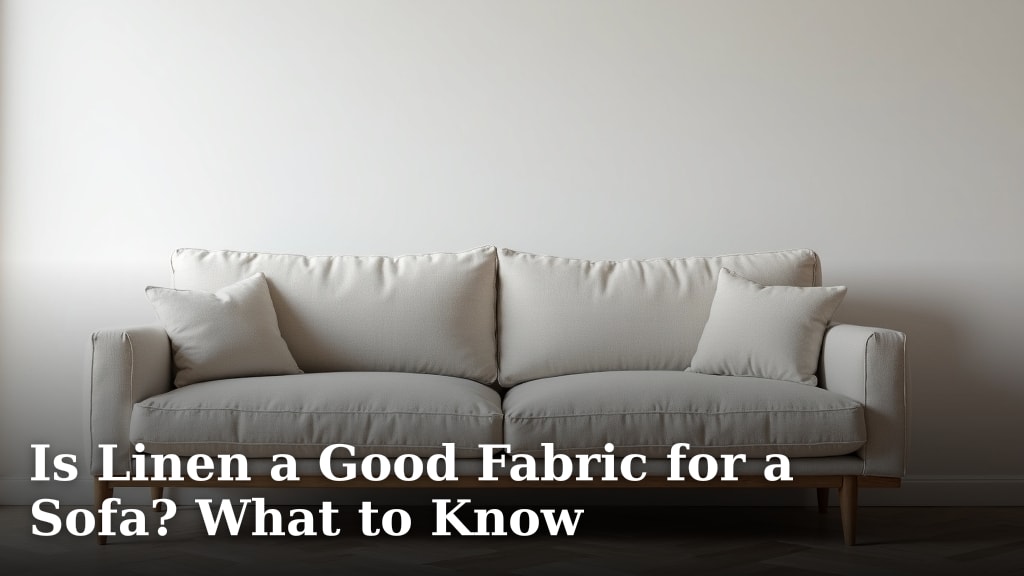
Linen suits low use rooms and shows creases and stains more readily, as Is Linen a Good Fabric for a Sofa? What to Know helps you judge.
Velvet catches light but shows footprints and dust more than a matte weave, as Is Velvet a Good Sofa Fabric? Pros and Cons explains.
Performance fabric and chenille for busy households
Performance fabric patterns are usually small and low contrast, which suits an ottoman. You can wipe spills and vacuum grit without worry.
If you want to compare fabric toughness before you commit, What Is the Most Durable Sofa Fabric? A Clear Look gives you a clear way to rank base fabrics.
Chenille patterns tend to be woven from the pile, so the design has depth without a printed look. That depth hides small scuffs from shoes.
The DOPEDIO loveseat below uses breathable chenille with a removable cover, and that same fabric logic transfers well to an ottoman.
Rule: choose performance fabric for daily use, and chenille when you want a soft pattern that hides light wear.
How does room size and light affect pattern choice?
In a small room, keep the pattern small and the contrast low. A bold print on a low piece in a tight space has nowhere to go, so it dominates the view.
In a large room, a bolder pattern can anchor the seating group. The ottoman sits farther from other pieces, so a stronger design has room to breathe.
Light changes how a pattern reads. A tone on tone pattern that looks plain in one light may show clear contrast in another, so check your swatch at the time of day you will sit with it.
Dark rooms need lighter patterns or stronger texture. A dark pattern in a dim corner can look like a shadow, while light warm colors lift the piece.
The TROMIRY loveseat shows a dark grey chenille in a compact 50 in width, with a button tufted back. That shows how a small piece needs strong simple detail to hold its own.
Lighting also affects how you use the ottoman. A reading corner needs a lamp scaled to the seat, and our Desk Lamp vs Table Lamp: Which Should You Choose? guide helps you match lamp type to the task.
Rule: scale pattern contrast to room size, and check the swatch in your room actual light.
How do you test ottoman fabric patterns before you buy?
Test ottoman fabric patterns with swatches viewed from standing height and from seated height. A footstool is seen from both angles, and a pattern can look fine from above but busy from the side.
Place the swatch on the ottoman top and step back to the sofa. Look at the sofa, rug and ottoman together, rather than at the swatch alone.
If your eye jumps to the ottoman first and stays there, the pattern is too strong for the room. Cut a paper template to the ottoman top size and draw a few repeats on it.
Tape the template in place for a day. This shows the actual cut at the center and edges without buying fabric.
Check the pattern direction. Stripes should run front to back on a rectangular ottoman and align with the sofa edge, as a sideways stripe can make a straight piece look crooked.
Cleaning and upkeep checks
Ask how the fabric handles vacuuming, spot cleaning and washing. An ottoman collects grit from shoes, so a fabric that vacuums well will stay fresh longer.
A removable cover is a major advantage. It lets you wash the top surface without turning a footrest into a project.
Tight weaves also release grit with a quick vacuum, while plush piles may need a brush attachment. Reserve linen or velvet patterns for low use rooms where you can clean them often.
Rule: choose a pattern on a fabric you can vacuum weekly and spot clean without fuss.
What mistakes should you avoid with ottoman fabric patterns?
Avoid a pattern that is too large for the top, too high contrast for the room, or too delicate for foot use. Those three errors cause most unhappy ottoman purchases.
A large floral cut in half at the center is the most common regret. It looks accidental from the sofa, and you will see it every time you sit down.
A second common error is adding a new color through the ottoman. A teal pattern in a beige and rust room will look like a misplaced accent and draw the eye to the smallest piece.
A third error is choosing a delicate fabric for a hard use spot. An ottoman takes shoe soles, pet paws and dropped objects, so a fragile fabric will show wear in weeks.
Reject any pattern that fails on scale, color or durability, even if you like the design. A smaller repeat in a shared color on a tough fabric avoids all three.
How do you coordinate patterns across sofa, rug and ottoman?
Coordinate patterns by setting one large pattern, one medium texture and one small pattern across the room. The ottoman usually takes the small pattern role.
If your rug has the largest pattern, keep the sofa solid or textured and give the ottoman a small geometric. If your sofa has the largest pattern, keep the rug solid or low contrast and give the ottoman a small echo of the sofa colors.
Keep the color story to two or three colors. The ottoman pattern should use at least one of those colors, and ideally the one that appears least elsewhere.
That gives the smallest piece a job without adding a new palette.
Texture counts as pattern for coordination. A chenille ottoman against a flat weave rug and a smooth leather sofa gives you three distinct surface types, which is enough variety for most rooms.
Rule: give the rug the largest pattern, the sofa the main fabric, and the ottoman the smallest repeat.
Which ottoman fabric patterns suit each room style?
Match the pattern family to the room style, then adjust the scale to the ottoman size. A style name alone is not enough, because a modern geometric can be tiny or huge.
A modern room suits small geometrics, fine stripes and tone on tone textures. Keep the palette tight and the lines clean, and let the ottoman repeat the sofa color in a smaller design.
A traditional room suits small florals, checks and subtle damask style repeats. The key is small scale and classic colors, so the pattern feels furnished rather than themed.
A cottage or casual room suits gingham, ticking stripe and small sprig prints. These patterns are forgiving at ottoman scale because their repeats are small and their contrast is soft.
A transitional room is the easiest fit, with a subtle texture or micro geometric that sits with most pieces.
Rule: pick a pattern family that matches the room style, then shrink the scale to fit the ottoman top.
How should you care for a patterned ottoman fabric?
Care for a patterned ottoman fabric with weekly vacuuming, prompt spot cleaning and seasonal deep cleaning. Grit is the main enemy, because it grinds fibers under foot pressure.
Vacuum with an upholstery brush at low suction to lift dust without pulling the weave. Turn the ottoman and vacuum all sides, then check the corners where grit collects.
A quick weekly pass prevents a pattern from looking dull.
Spot clean spills as soon as they happen, and blot rather than scrub. Scrubbing pushes the stain deeper and can fade a printed pattern at the spot.
Use the cleaner recommended for that fabric type, and test it on a hidden corner first.
Wash a removable cover on the gentle cycle with mild detergent when the maker allows it, and air dry to protect the pattern and the fit. Heat can shrink a cover and distort a repeat, which is especially visible on a small piece.
Rule: vacuum weekly, blot spills right away, and wash only when the fabric maker allows it.
What is the best way to choose ottoman fabric patterns for your room?
The best way to choose ottoman fabric patterns is to start with scale, repeat one room color, and pick a durable fabric. That order keeps the decision practical and the result coordinated.
Measure the ottoman top, note the sofa and rug colors, and hold swatches against the actual pieces at sofa distance. Reject any pattern that is too large, too contrasty or too delicate for daily foot use, even if the sample card looks appealing.
For most living rooms, a small geometric or fine stripe in performance fabric or chenille, in a color shared with the sofa or rug, gives you a piece that looks designed and wears well. That is the safest starting point, and you can adjust contrast up or down from there.
Rule: choose the smallest repeat that still reads as a pattern, in a shared color, on a fabric built for foot use.
Frequently asked questions
What pattern is best for an ottoman?
A small geometric, subtle stripe or solid works best for most ottomans because the surface is small and seen at close range. Large florals and busy repeats can look cut off, so choose a repeat that shows at least two full motifs across the top.
Should an ottoman match the sofa fabric?
No, you can use a coordinating pattern, texture or color instead of an exact match. Use the ottoman pattern to repeat one color from the sofa or rug, and keep the scale smaller than any large pattern nearby.
What fabric is best for an ottoman that gets daily use?
A tight weave performance fabric, chenille or a durable cotton blend usually handles daily foot use better than linen or velvet. Look for a removable cover, stain resistance and a weave that does not snag or show every footprint.